Do thumbnails and titles make a difference inside the Amazon Influencer Program?
After all, they are only videos, Right?
Wrong, let me explain why Thumbnails, in particular, are really important.
A compelling thumbnail can make the difference between standing out and attracting the click and commission, versus being lost in the upper carousel.
Incorporating specific design elements into these visual cues can significantly impact their effectiveness, resulting in increased clicks and, potentially, more leads and sales through affiliate links.
How well do you actually understand the Amazon Influencer Program? Test your knowledge and avoid rejection! ✍️ Take the quiz now!
The design and messaging of a thumbnail can alter a viewer’s first impression and influence their decision to engage.
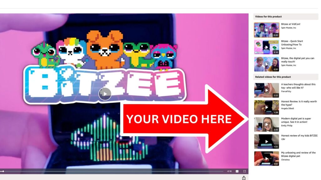
For instance, employing arrows in various colors within the thumbnail may suggest a product’s pros or cons, thus affecting audience response. Similarly, a template approach allows for rapid production of visually consistent thumbnails, which can stand out in a crowded carousel.
Moreover, the choice of words used in conjunction with design elements like arrows or question marks can spark curiosity.
Phrases and terms like “Pro Tips” exude authority and promise insider knowledge, further enticing clicks. Understanding these nuances and avoiding common pitfalls, such as obstructed information due to platform-specific features like time stamps, can enhance the performance of content within the digital marketplace.
Check out my private community where we grow our income from the Amazon Influencer program Together. Check out SHI today here!
Key Takeaways
- Thumbnails have a significant impact on viewer engagement, possibly more than titles.
- Strategic design elements like color-coded arrows and word choice can influence audience perceptions.
- Standardized templates, clear messaging, and avoiding design mistakes are crucial for effective thumbnails.
- Thumbnails are simple to create
Impact of Video Thumbnails and Titles on Viewer Engagement
In the competitive realm of the Amazon Influencer Program, the visual appeal of a thumbnail paired with an engaging title plays a critical role in capturing audience’s attention.
Crafting effective thumbnails and titles is an art that can significantly impact the number of video clicks and, consequently, product sales.
Here’s a closer look at the effectiveness of various thumbnail and title designs based on my experience as an influencer.
Thumbnails: The Visual Hook
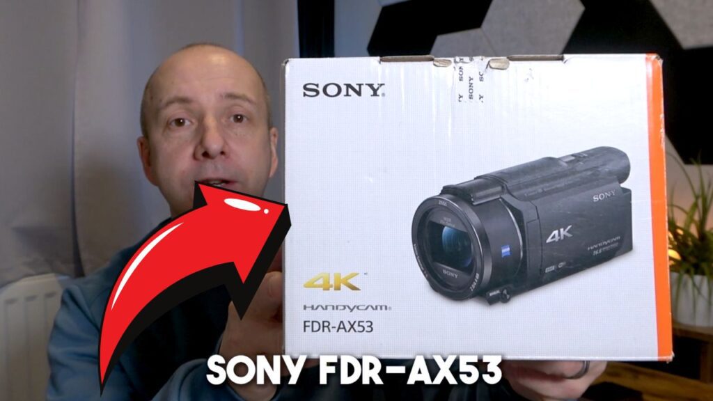
- Arrow Designs: A simple yet powerful tool is the use of arrows in thumbnails. They direct viewer attention and suggest a product’s pros or cons. Example: A red arrow can signal caution and provoke curiosity, while a green arrow may impart a positive impression.
- Template Thumbnails: Employing a repetitive template that harmonizes text such as “My Honest Review” with the product imagery streamlines content creation and establishes brand consistency. Example: The fourth thumbnail in a sample carousel, “The Astro AI Heat Review,” stands out for its clarity and simplicity.
- Question-Based Thumbnails: Incorporating questions like “Does This Work?” or exclamations such as “I Can’t Believe It!” can intrigue viewers. Example: A thumbnail titled “My Thoughts” can be compelling if it promises a personal and genuine insight into the product.
- Expertise Indicators: Phrases like “Pro Tips” imply a level of expertise and insider knowledge. Example: A yellow box containing “Pro Tips” stands out, except when overcrowded designs or misplaced product information hampers legibility.
- Combined Elements: A mix of bold typography, colors, and questions or claims like “Worth It?” with a green arrow can pique interest by suggesting unique insights or evaluations. Example: A concise and bold combination of a red question mark and text “Should I Buy It?”
Titles: The Subtle Nudge
Unlike thumbnails, titles may be seen as less critical but still contribute to viewer engagement. A title’s ability to entice taps depends on its resonance with potential viewers’ interests or concerns. Using impactful words—such as “Genius,” “Epic,” “Unique,” “Remarkable,” or “Unbelievable”—can enhance a thumbnail’s effectiveness and curiosity.
Exploring Carousel Dynamics
The carousel feature, predominantly active in the United States yet expanding globally, showcases up to five influencer-created videos adjacent to the featured product video. These videos, often encompassing product reviews or unboxing content, aim to inform viewers and, ultimately, sway them to make a purchase, thereby generating a commission for the content creator.

Visual Magnetism: Thumbnail Strategies
Arrows: Utilizing arrows in thumbnails capitalizes on their power to direct attention. For instance, a bold, red arrow may signal caution or highlight a drawback of a product, prompting curiosity and engagement. Conversely, a green arrow could suggest positive aspects or endorsements of an item, creating an upbeat impression.
Templates: A consistent template for thumbnails can streamline production and ensure cohesion across an influencer’s content. An example would be splitting the thumbnail into a textual area proclaiming “Honest Review” against a stark white backdrop, paired with a product image. Such clarity helps viewers immediately recognize the content’s nature, making it stand out in the carousel.
Intriguing Titles: Phrases such as “Does This Work?” or “I Can’t Believe It” can spark interest and motivate clicks. A thumbnail featuring the question “Does This Work?” prominently displayed may often outshine others due to its direct appeal to viewer curiosity.
Expert Insight: The use of ‘Pro Tips’ accompanied by a highlighted box can convey authority and insider knowledge. However, it’s important to avoid clutter and not obscure crucial thumbnail details, like avoiding the bottom right corner where YouTube typically places the video’s timestamp.

Element Combination: A strategic assortment of bold colors, singular impactful words like “Worth It,” and simple icons like arrows or question marks can magnify viewer appeal. This tactic plays on human curiosity and the desire to discern whether the influencer deems the product a worthy investment.
Singular Focus: “Genius” or similar exclamatory single words in attention-grabbing colors, complemented with an arrow, can be highly effective. The simplicity of the design, coupled with the weight a single word can carry, often results in a striking visual that draws in the viewer.
Although utilizing vibrant colors and avoiding complexity are common practices, there’s a noticeable absence of emojis and expressionistic elements within these thumbnails. The reason for this could vary and warrants further investigation regarding platform guidelines and terms.
Influencers are encouraged to engage in due diligence to respect platform policies and maintain control over their content strategies. It’s clear that while both titles and thumbnails contribute to attracting viewers within the carousel, the visual component tends to take precedence in influencing audience interaction.
Thumbnail Creation Techniques
Utilizing Directional Markers
In digital marketing, incorporating a simple arrow in image previews can significantly enhance visibility. A brightly colored directional marker can draw the eye to key features or concepts, acting as an attractor in a sea of visual options.
Standardized Image Templates
Creating a uniform template for image previews can expedite the production process and ensure consistency, which can aid in brand recognition. A split design with a textual segment on one side and product imagery on the other allows for rapid customization while maintaining a clear and professional look.
Incorporating Familiar Phrasing
Using phrases that prompt curiosity or imply insider information can make one preview more enticing than others. Expressions like “Does this work?” or “I can’t believe it” provoke engagement by suggesting useful insights. Adopting phrases that viewers are already predisposed to notice, the thumbnail becomes a clear invitation to explore the content for answers.
Expert Insight Indicators
Including terms like “Pro Tips” in image previews can position the creator as an authority, promising expert knowledge or exclusive advice.
Suggesting that you know something the other Influencers don’t can help gain the click
Integrating Multiple Elements
Adding multiple elements like an arrow and a word, or a question mark and a word can also stand out and attract attention on the carousels.
Singular Term Impact
Sometimes, simplicity reigns. Employing a single, impactful word such as “Genius” can captivate an audience with its bold directness. The isolated term, contrasted with a stark background and perhaps paired with an arrow, can resonate deeply. It invites interpretations and promises a revelatory experience tailored to the product or topic at hand.

The Influence of Visual Clarity and Coloration
When participating in the Amazon Influencer Program, it’s vital to consider the potential influence of video titles and thumbnail designs on viewer engagement. While titles hold value, thumbnail visuals typically draw more attention, impacting click-through rates.
On the video carousel feature of the program, viewers in the United States, and increasingly in other nations, encounter video selections next to products. These videos, produced by fellow influencers, aim to convince potential customers of a product’s benefits, leading to a purchase and earning the influencer a commission via qualified sales.
Various thumbnail design strategies can be employed:
- Arrow Design: Incorporating arrows in thumbnails can distinctly enhance visibility. An arrow may point towards a product, a significant word, or act as a bold color marker. For instance, red arrows can signal caution, suggesting an issue with the product, while green arrows may imply a positive aspect.
- Template Dynamics: Utilizing a standard template allows for rapid and recognizable thumbnail creation. For example, a thumbnail with “My Honest Review” as a uniform side banner next to an image of the product can quickly become notable among other videos.
- Direct Inquiry Thumbnails: Employing phrases like “Does This Work?” or “I Can’t Believe It” in thumbnail designs can effectively garner attention. These thumbnails often stand out, driving the audience’s curiosity about the video content.
- ‘Expert Insight’ Thumbnails: Using terminology such as “Pro Tips” positions the influencer as knowledgeable. Thumbnails with the words “Questions Answered” within a distinct color box convey expertise and a promise of valuable information, setting it apart from more cluttered designs.
- Merged Element Thumbnails: Combining a striking color with a single word, such as “Worth It” alongside a green arrow, cultivates intrigue. Single-word thumbnails like “Genius” with a powerful color background and a directional arrow can pique viewers’ interest effectively.
While these strategies enhance engagement, it’s crucial to avoid overlaying important thumbnail details where video time stamps may obscure them, such as the bottom right corner.
Limited Use of Visuals and Expressive Icons
There are some terms and conditions to abide by set by Amazon so some Emojis and Icons are not permitted. The POO emoji as an example might get your video rejected.
Effective Thumbnail Strategies
Creating engaging thumbnails is a key factor in attracting potential viewers to your videos within the Amazon Influencer Program’s carousel display. Employing various tactics can significantly impact whether a product review or unboxing video leads to a sale. As an influencer, one of my main objectives is to leverage visual elements that can grab attention and encourage clicks.
Arrow Incorporated Thumbnails
- Incorporating arrows directs the viewer’s attention and can suggest positive or negative aspects depending on the color.
- Red arrows can suggest caution or something negative about the product, prompting curiosity.
- Green arrows often denote positivity, indicating the good qualities of a product.
- In a comparison of multiple thumbnails, designs with noticeable arrows tend to be distinct and can lead to higher engagement.
Template-Based Thumbnails
- Utilizing a consistent template, such as a side-by-side layout with the product image and a bold statement, enhances recognition.
- Templates created in programs like Canva allow for quick and efficient production of thumbnails.
- A standout example would employ the phrase “My Honest Review” on a white backdrop alongside the product image, gaining prominence among others in a carousel.
Question & Statement Thumbnails
- Simple yet evocative phrases like “Does This Work?” or “I Can’t Believe It” instantly engage viewers.
- By posing questions or providing assertive statements, these thumbnails prompt an immediate reaction to learn more.
- Amongst various thumbnails, those with clear and intriguing captions quickly draw the eye.
Expertise Indicating Thumbnails
- Using terms like “Pro Tips” can imply specialized knowledge, setting the video apart as an authoritative source.
- Attention should be paid to the placement of elements to avoid obstruction by video time stamps, with the ideal position being away from the bottom right corner.
- Thumbnails that keep the designs uncomplicated and avoid overloading with text or graphics usually stand out more effectively.
Element Combination Thumbnails
- Combining a bold color, a single word, and an arrow can create a strong curiosity factor.
- Words like “Worth It” accompanied by an Arrow or “Should I Buy It” with a red question mark can drive viewers to seek insight from the video.
- The choice of words and graphics should pertain to the product’s unique selling proposition to resonate with viewers’ purchase considerations.
Single-Word Focus Thumbnails
- A single emphatic word like “Genius” or “Epic” can make a powerful statement.
- Common vocabulary with a strong arrow pointing towards the word can significantly impact audience curiosity, provoking interest to click and watch.
- The implication of the word selected should relate to the nature of the video content for it to be effective.
While thumbnails are integral to capturing attention, it’s essential to ensure that they comply with the Amazon Influencer Program’s policies.
A noticeable absence in the examples observed was the use of emojis or expressive icons, which may be due to platform-specific guidelines. Always verify these details to tailor your content strategies appropriately and manage your influencer business effectively.
Final Observations and Careful Consideration
It’s clear to see from my data and income reports that Thumbnails can and do attract click, with titles being less important.
But, why not do both?
Spending 5 minutes on a Thumbnail and a good title could produce results for years to come growing your side income with the Amazon Influencer program.
If you’d like to learn more about making money through the Amazon Influencer program, consider joining my private online community called the Side Hustle Insiders.

